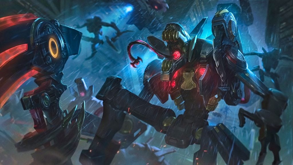
The Praetorian skinline currently consists of two champions: Fiddlesticks and Graves. Throughout the project, I’ll refer back to these two champions to get a sense of the form language and narrative that I’ll need to be faithful to.


Narrative Direction
The Praetorian line is the main antagonist force in the Pulsefire Universe. A consistent theme between Graves and Fiddlesticks skins is the overwhelming numbers/replaceable drone robot spin. Rhaast, on the other hand, has a much stronger personality (bloodthirsty, vain, funny) that wouldn’t fit well as a replaceable unit. Furthermore, the narrative for base Kayn just screams “main character” with the ‘choosing a path’ mechanic. In order to do justice for Kayn players, I felt it important to carry that amount of significance over to the skinline. In this instance, Praetorian Rhaast would need to be a Big Bad Robot Boss instead of a grunt. Similarly, Shadow Assassin Kayn would need to be some kind of supercool hi-tech protagonist to rival.

“In order to do justice for Kayn players, I felt it important to carry that element of significance over… Praetorian Rhaast would need to be a Big Bad Robot Boss instead of a grunt.”
The whole time travel spin on the Pulsefire/Praetorian skins works pretty well with Kayn’s branching paths mechanic. At the point in the game when the player chooses which form to take, either Rhaast or SA Kayn will jump into the timeline via a portal and replace base Kayn with an appropriate amount of explosions and blue lightning.


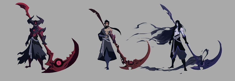
The scythe also fits nicely as a vehicle for time travel- picture the action of “cutting” open portals- so the scythe’s appearance should shift to reflect each respective motif (hi-tech machinery vs ugly angular exposed wires).
Identifying Archetypes
Base Rhaast has a very triangular design to him. Wide shoulders, hourglass figure, muscular legs & arms. He reads almost like a dangerous bully- violent disposition, confident/jeering attitude, not elegant in the slightest. His massive horns bring a lot of otherworldliness to his otherwise mostly anthropomorphic silhouette. It’s very much his identifying feature, so a lot of work is going into translating that into something befitting a scary robot boss. The darkin aesthetic has a lot of fleshy, organic bits going on. Negotiating that with the majority harder surfaces of robots is a challenge.

Designing The Skin

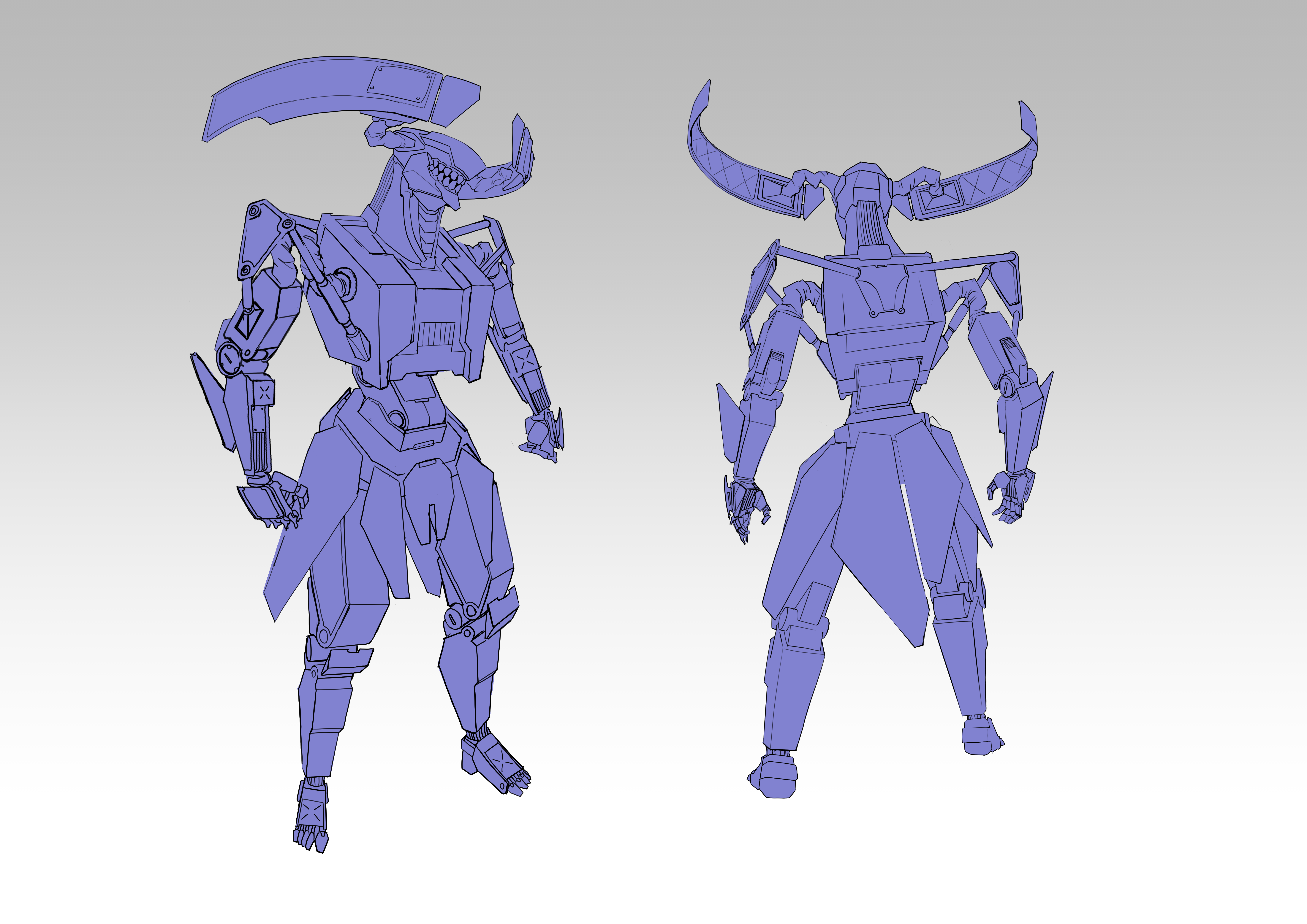
As far as the Praetorian skin goes, earlier explorations spent a lot of time feeling out the specific details of the existing skins. Graves is built very blocky, while Fiddlesticks is almost skeletal in appearance. Rhaast would probably fit somewhere in between. I needed to avoid too much similarity with other sci-fi skins, like PROJECT or Mecha Kingdoms.


Model explorations helped me envision what this skin might actually look like on the Rift. Considerations like readable detailing and recognizable silhouette start to come in. At the same time, I was learning how to work faster and how to more closely adhere to League’s visual style. I allowed the horns to lead the direction of the character, building the torso armor and scythe to follow the look I was going for.
One inspiration that kept popping in here and there was the Terminator Franchise -both thematically and visually- one homicidal time travelling robot to another. I liked the exposed hydraulic piston look that communicated a more functional purpose while mimicking the movement of bones and tendons.


Another detail I included later was the canvas cloth that covers more flexible appendages- seen in the Boston Dynamics robots and the Cyberpunk 2077 Militech Spider. I think it grounds the design a little better, moving it away from something super high tech and closer toward the slightly more realistic chunky hardware sported by Praetorian Graves.


Closing Thoughts
A lot of the concept workflow was hamstrung by my sheer inexperience. I did a lot of learning on the fly not just adopting League’s visual style, but also building more confidence in just using CSP. I spent a lot of unseen time deliberating on details that ended up leading nowhere, but that’s just the price I have to pay for learning. All things considered, this was a fun project. I’m looking forward to revisiting the Kayn & SA Kayn side of things at a later time.
